
Cores and effect
Beware of any claims about "the" core inflation rate. But there are some measures that are more informative than others.


The Reserve Bank’s next review of the Official Cash Rate is coming up soon, and it’s turning out to be a live one - that is, there’s some genuine uncertainty around what the decision will be. Inflation has come off a bit faster than the Reserve Bank was expecting, down to 4.7% at the end of last year. But that may not be good enough - there’s been a lot of talk about how ‘core’ inflation is coming down too slowly for the RBNZ’s liking, and might even require further action to rein it in.
Core inflation is one of these terms that economists are accustomed to throwing about without specifying what they actually mean by it. And for everyone else, it’s probably bewildering at best, and at worst sounds like a shifting of the goalposts. Isn’t the RBNZ supposed to target the headline inflation rate? Where does it say that they have to control some other set of prices as well?
Here I’m going to set out how I’ve come to think about core inflation. This is my own take; other economists might well explain it in different ways. But I’m going to try to demonstrate my point by putting some numbers around it.
A good place to start is the speech that RBNZ Governor Adrian Orr gave at the University of Waikato Economics Forum last week. Here’s the key quote:
A key challenge for policymakers is distinguishing between the ‘transitory’ and ‘persistent’ or ‘core’ components of inflation.
As the name suggests, ‘transitory’ inflation represents price movements that are expected to be temporary. Transitory inflation is generally caused by unexpected price shocks that tend to dissipate naturally over the medium term.
Core inflation represents pricing pressures that are likely to persist once temporary shocks have unwound. Core inflation is driven by things like capacity constraints – the balance between supply and demand – as well as labour market dynamics and wage inflation. They reflect general, rather than relative, price movement in the economy.
This is as good an explanation as I’ve seen of the concept of core inflation. But it doesn’t get us yet to a measure of it. The problem is that we only know in hindsight whether a source of price increases was persistent. So how can we say anything about what core inflation is today?
Generally speaking, we do it by slicing up the details of the Consumer Price Index into the parts that we think are more likely to be persistent. That judgement can be based on history, or on the nature of the market for a particular product, or just on rules of thumb. That leaves us with a wide range of possible measures, but there are some more commonly-used ones, which I’ve grouped into three categories:
1: Major groupings
For a long time, the RBNZ has used a split between ‘tradable’ and ‘non-tradable’ items. Tradables are items whose prices are strongly determined by international forces. That includes things that we can export (for instance, we effectively pay the world price for butter), things that we import (such as petrol), and things we make locally that compete with imports (such as furniture). Everything else is non-tradable; their prices are determined by forces within the local economy.
Historically, tradables inflation has been quite variable, while non-tradables inflation has had more persistence. There are a couple of reasons for that. First, non-tradables aren’t as exposed to the vagaries of international markets. Second, they are heavily weighted towards services, where wages and salaries are often the biggest input cost (and wage inflation itself is quite persistent - wages may rise at a faster or a slower pace, but they hardly ever fall).
Non-tradables is often used as a shorthand for core inflation. While there will be a lot of overlap between them, they’re not the same concept. Orr’s speech explains the difference:
Measures of core inflation help us identify how much of headline inflation is persistent, while non-tradable and tradable inflation help identify where inflationary pressures are emerging from.
The origin of the tradable / non-tradable split was a view that, as a small trade-dependent nation, a lot of the variation in New Zealand’s prices would be due to factors that are beyond the control of domestic monetary policy. For this reason, it’s pretty much a New Zealand thing; I know that Australia also publishes these numbers, but they’re rarely if ever cited.
Another split that we sometimes look at is between goods and services. There’s a lot of overlap between this and the tradable / non-tradable split, but with some notable differences - for instance new home builds, which make up almost 10% of the CPI, are a non-tradable good.
2: Exclusion measures
One way to get a more stable measure of inflation is to remove the bits that are known to be volatile. Typically that has meant food, or fuel, or both. Food prices may rise because of poor growing conditions, which (1) won’t necessarily be repeated next season, and (2) don’t respond to interest rates. And world oil prices are just really volatile, and tend to be passed through to pump prices very quickly.
CPI excluding food and fuel is the closest thing we have to a commonly-agreed measure of core inflation. The advantage is that it’s fairly easy to calculate for any country, so we can use it to make international comparisons.
The downside is that we’re throwing out a lot of information about prices - about a quarter of the CPI in New Zealand’s case. And research has shown that food and fuel prices are highly ‘salient’ - they have an outsized impact on people’s perceptions of inflation, which in turn may affect their decisions when setting other prices.
There are many other possible ‘CPI ex’ measures that may or may not be of use. One that I’m going to look at a bit later is CPI excluding central and local government charges - the idea being that it leaves us only with prices that are determined by market forces.
The Reserve Bank of Australia has long used a different kind of exclusion method: rather than removing specific items all the time, they remove the most variable prices in any given period. That might include fuel in one quarter, airfares in the next quarter, avocados in the one after that. The reason for this is that large price movements are usually specific to that product; they tell us the least about general inflation pressures.
The following chart demonstrates how this works, using the most recent CPI for New Zealand. (Bear with me, there’s a reason I’m going to dwell on this for a bit.) First, we rank all of the price changes in the CPI from lowest to highest. Each price can appear multiple times in the ranking, depending on its weight in the CPI. For example, vegetables have a weight of 1.7%, so if we have 1000 entries in our ranking, 17 of them will be for vegetable prices. (They’re the block on the left side of the chart - they fell by 14.9% in the December quarter.)
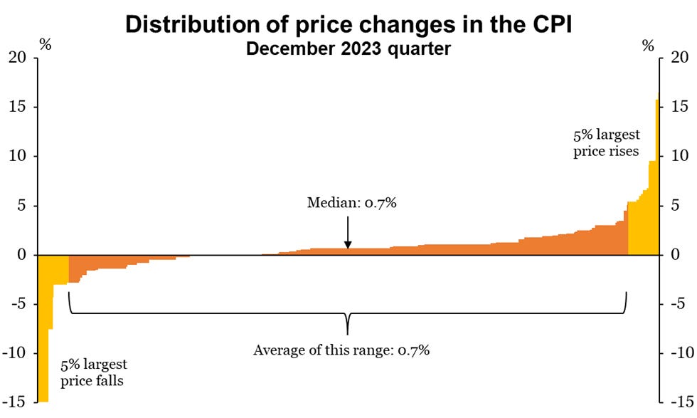
From here, the RBA uses two different measures. The first is the ‘trimmed mean’. For this, we chop off the top 5% and bottom 5% of the distribution, then calculate the average price change for the remaining range. In this example, the trimmed mean for the quarter was a 0.7% increase, compared to an average of 0.5% for the entire range.
The second measure is the ‘weighted median’, which is simple enough: just take the price that’s at the midpoint of this distribution. You can think of this as an extreme form of exclusion method, where we remove every item except the one in the middle. That item will differ from one period to the next; in this case it’s new home builds, which rose by 0.7%.
3: Filtering methods
So far, we’ve been taking actual prices and recombining them in hopefully useful ways. The third method is quite different. It uses more complex techniques to generate a data series that is meant to capture the ‘common thread’ in price movements.
A while back, the RBNZ introduced its ‘factor model’ of core inflation, followed a few years later by a ‘sectoral factor model’. (The difference is that the second one estimates separate factors for tradable and non-tradable items.) These are published in the afternoon after a CPI release, and since they seem to be the RBNZ’s preferred gauges of core inflation, they’ve become something of an event for financial markets.
The factor model measures are, by design, much smoother than the other ones I’ve covered here. That is one desirable feature of a core inflation measure: we want something that isn’t going to be swayed by unusual price movements or just noise.
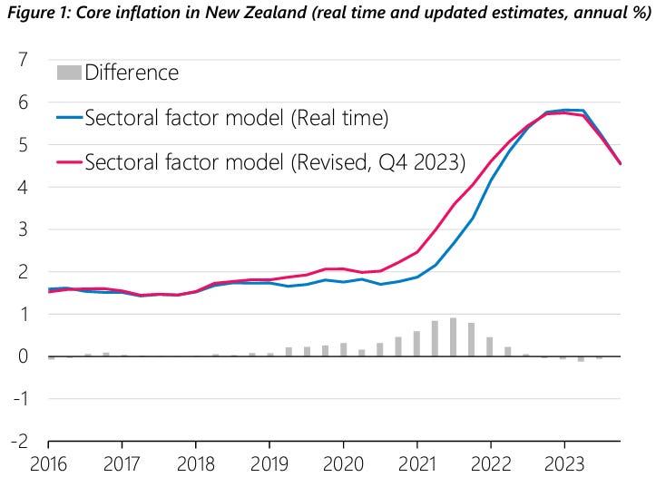
But there is a major flaw with these measures. As I’ve discussed before, filtering methods have an end-point problem: every time you add a new data point to the end, the recent history also gets recalculated. After years of these revisions, the results can end up looking quite different from what they were on first publication. And that’s a big issue for policymakers like the RBNZ, because policy decisions are made in real-time, not with the benefit of hindsight.
Orr’s speech includes a chart that demonstrates this problem. In mid-2021, with headline inflation at 3.3%, the sectoral factor model was suggesting that core inflation was right on the 2% target. Today, after years of revisions, it now suggests that core inflation at the time was 3% and rising fast. I suspect the answer will be different again a year from now.
So which of these should we use as the core inflation rate? Arguably none of them. In fact the position that I’ve come to is: there is no such thing as “the” core inflation rate. There is the inflation rate, as measured by the CPI, and everything else is an attempt to interpret it.
Specifically, what we’re trying to learn is: how much of this will persist into the future? It’s effectively an exercise in predictive power. Which is good, because that’s something we can test!
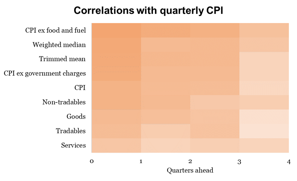
Below, I’ve created a heat map that shows how well some of these measures predict the CPI one to four quarters ahead. There are many ways you could do this sort of exercise, and I don’t claim that this is definitive. For those who want the details of what I’ve done, see the footnote.1
Here are the highlights, some of which came as a surprise even to me:
CPI excluding food and fuel comes out on top, by quite a sizeable margin. That’s a nice result: the measure that most people associate with ‘core inflation’ is actually the best at identifying persistence (in New Zealand at least).
The weighted median and trimmed mean are next in the rankings. Those measures are rarely discussed here - they’re much more an Australian thing - but these results suggest that they deserve a lot more attention.
CPI excluding government charges (i.e. non-market prices) also works well.
Of course the CPI can predict itself to some degree. So any ‘core’ measure that ranks below this is not really adding anything.
Non-tradables does about as well as the CPI itself, but no better.
In general, predictive power drops off markedly after three quarters. That sounds about right: the further ahead you go, the more that inflation will be driven by fresh shocks rather than anything that happened in the past.
You may have noticed that I didn’t include the RBNZ factor models here. There are two reasons for that. First, the way that they’re calculated means that they only exist as an annual rate of change; there is no quarterly index underneath them. Second, using the revised series will overstate the degree of ‘predictive’ power, and unless you have the entire history of the revisions, it’s impossible to construct a quarterly real-time series for them.2
To finish up, I take two things from this exercise:
Simpler is also better; don’t overthink it.
The rapid drop-off in predictive power within a year suggests that we should be careful about overselling the ‘stickiness’ or ‘persistence’ or ‘stubbornness’ of inflation. Perhaps it’s not inflation itself that persists, but the conditions that lead to it.
I used the quarterly changes in each of these series, from March 2001 to December 2013. The CPI has a strong seasonal pattern, so I adjusted every series using the seasonal R program online. I made manual adjustments for the increase in GST in the December 2010 quarter, which added about 2% to the CPI basket. I’ve used quarterly changes because annual rates, by construction, have a high degree of persistence and will overstate the true correlation.
As an exercise, I created a quarterly series that matched the annual rates of change in the ‘revised’ factor model series. Even with the benefit of years of hindsight, it did not outperform CPI ex food and fuel in real-time.
Is autocorrelation the best metric here? Persistence is often thought of as the bits most related to excess demand. It’s not clear that autocorrelation really gets at that?