


Measuring the housing shortage
It’s evident that the housing supply is out of whack. Putting a number on it is tricky though, and reasonable people can come to very different conclusions.

New Zealand’s housing shortage is once again rearing its ugly head. The Covid border closure gave us the best opportunity we’ve had to decades to shrink that gap: population growth slowed to a trickle, while a strong economy and low interest rates helped to power a surge in homebuilding. But that progress is starting to unwind, as my Westpac colleagues noted this week. Net inward migration has surged to new highs, at the same time that the pipeline of building work is easing off.
Some places feel this pain more than others. Auckland gets a disproportionate share of the migrants that arrive here, so it tends to see the biggest swings in housing demand (in both directions). And in recent months we’ve had a string of increasingly bleak reports about the accommodation shortage in Queenstown – as the overseas tourists have returned, so have the workers, only to find that there’s nowhere affordable to live. This problem is far from a new one though. On Twitter I’ve occasionally shared this photo that I took at the excellent Lakes District Museum in Arrowtown – check out the date:

Every now and then an economist is brave enough to try to put a number on the scale of the housing shortage. To give some recent examples:
In 2019 Kiwibank estimated a shortage of 130,000 homes, up from 100,000 the previous year.
Infometrics responded with their own estimate of a 40,000 shortfall.
By last year, Kiwibank estimated that the Covid-era building boom had reduced the shortage to 23,000 homes, from 57,000 a year earlier.
At the same time, my colleague Satish Ranchhod put the shortage at 45,000 homes, down from 75,000 a year before.
Behind these sometimes wildly different figures are, I suspect, a fairly similar framework with some different assumptions going into them. We tend not to restate those assumptions every time we publish an update, and since our original work on this was done over 15 years ago, it wouldn’t be surprising if all but the most dedicated of readers are unaware of what goes into it. In this post I’m going to give a bit of background to our approach, and in doing so, demonstrate the bounds of uncertainty around any of these estimates.
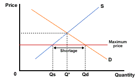
To start off, what do we actually mean by a shortage? In Economics 101, that’s when demand exceeds supply, right? But that situation can only persist if there’s something that prevents the price from rising to bring demand and supply into balance. That’s clearly not the case in the housing market; prices have risen freely over the years. So in one sense, our best estimate of the shortage is zero. People might like to have more living space if it were available, but at today’s prices, they don’t demand it.
When house prices rise, we would expect to see two responses. Firstly, the supply of houses should increase. Higher prices for completed homes will increase the margins for developers, inducing them to build more. However, the strength of that response depends on how much flexibility there is in their own inputs. If their inputs are constrained in any way – and the availability of land is the biggest issue here – that pressure will simply be channelled into higher building costs, rather than higher margins and more homes.
The other response is that the number of homes demanded should fall, as higher prices prompt people to find ways to economise on their living space. That can happen in many ways: young adults not leaving the nest, people moving into ever-more crowded flats, homeowners taking in a boarder to help pay the mortgage, or young professionals going in together on a house. Or at worst, people can be forced to live in places that don’t count as dwellings, like motels, garages, or cars.
Now we’re starting to get at what people mean by a housing shortage: the market is in equilibrium, but it’s getting there in ways that can be seen as socially undesirable. We shouldn’t have to put up with cramped living conditions, and likewise we shouldn’t have to put up with being so bad at building new houses. When we talk about a housing shortage, we’re actually talking about a shortage relative to how we would like people to live.
And here’s the challenge when you try to put a figure on the shortage: who’s to say how “we” should live? Everyone has different needs and desires, depending on their income, their stage in life, their family situation, their cultural background, and so on. It’s easy to make the mistake of projecting your own preferences onto the wider population. Just because you prefer a house with a backyard over a one-bedroom apartment, it doesn’t mean that everyone wants to pay for that much space.
History does provide us with some guide to this question. Here’s a chart that was in our original 2008 paper, which I’ve tried to recreate (though I don’t have the source data prior to 1991) and extended out to this year.

Since at least the 1960s, there has been a steady decline in the average household size in New Zealand. A lot of things have changed over that time. Access to contraception, and more economic opportunities for women, have led to smaller families with fewer children on average. Divorce has become more acceptable, meaning more split households. And the ageing population mean a growing share of two-person households, where the kids have grown up and moved out, and eventually one-person households where someone has outlived their partner.
Importantly, these are all long-running trends. It’s debatable whether some of their effects are petering out by now, but certainly none of them have gone into reverse in recent years. So the key assumption in our model is that the desired average household size has continued to fall over time. Therefore, any increase that we observe in the actual household size, such as in the mid-2010s, must be involuntary – where people have been forced to crowd up more than they would like to.
You can get support for this history-based approach by looking at other countries – I suspect you’ll see a similar pattern in almost all of them. Or you can go even further and look at regions, as we did in this 2014 paper. I’d actually forgotten about this one, and was kind of shocked to recall the extent to which the housing shortage (at the time) was almost solely an Auckland one – most other regions continued to see household sizes drift lower. I very much doubt that demographic forces suddenly changed direction in 2010 in Auckland and nowhere else in the country; a lack of building seems a much more likely explanation.
So the remaining question is where do we draw the line for the ‘desired’ level of housing, if a lack of supply had not been an issue. There’s not a lot of science here, and reasonable people can come to different conclusions. But it’s worth noting that seemingly small differences in your assumed path can produce quite different estimates of the housing shortage.
The chart below shows three hypothetical trendlines for the desired household size. The top line gives us a desired average today of about 2.5 people per household; the second line gives us 2.3 people, and the bottom one gives us 2.1 people. All of these are plausible extrapolations from history; all of them are in the range of what we see in other rich countries.

If the top line was the ‘true’ desired level, it would suggest that the building boom during the Covid border closure got us most of the way to closing the gap – about another 30,000 new homes would do it. At the recent peak, we were adding about 45,000 per year (net of demolitions) to the housing stock. If we could keep up that pace, we would eliminate the shortage altogether after a year or so, even with some population growth in the meantime.
What if we wanted to get the average household size down to 2.3 people? In that case we’d need another 200,000 homes right now. Even if population growth slowed down from its current pace to around 1% a year, we’d have to keep building at the same peak pace for another eight years in a row to get there. (Actually a bit less, because the building industry would be able to grow its capacity over that length of time.)
And if our desired household size was 2.1 people then, applying the same calculations as above, we’d need a whopping 400,000 additional houses. It would take 14 years of flat-out homebuilding to close that gap.
Which line you choose is perhaps more a question of how you want to communicate the issue. In the first example there is at least the possibility of alternating between ‘shortage’ and ‘surplus’, with the latter providing a signal to the building industry that it can slow down to a more sustainable pace. In the last example, capacity constraints and the economic boom-bust cycle make it unlikely that we could ever close that gap, which would leave us describing the housing market as being in a permanent state of shortage. One thing I would say is that no plausible set of assumptions would have us in a housing ‘surplus’ right now.
I’ll finish up by noting that there’s a lot of common ground between discussions of housing shortages and housing affordability. They’re just using different axes of the supply-demand diagram; one focuses on quantities and the other on prices. What that means is that any metric of what is ‘affordable’ is going to have just as much subjectivity as our metrics of what is ‘sufficient’. I prefer to focus on the quantity side because I feel that the people-per-house measure has at least some grounding in demographics; there’s no equivalent when it comes to the price level.