


How soon is now?
The hunt for timelier evidence on the state of the economy continues.

I wasn’t planning to comment on the Reserve Bank’s Monetary Policy Statement this week; in any case the policy decision and forward guidance have been ably covered elsewhere. But flicking through the document for some interesting charts, I soon came across this, which touches on something that I was aiming to write about at some point:
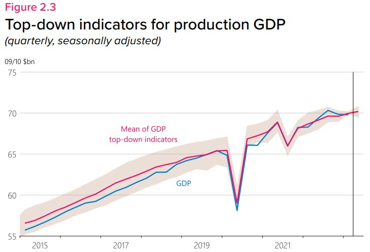
To my knowledge there isn’t a paper behind this work, so all I know about it is what’s in the footnote. In part, the RBNZ has taken a handful of activity indicators, individually regressed them against GDP, then taken the predicted levels of GDP from every regression and averaged them. This is a pretty cheap and cheerful way of blending forecasts; it gets around the fact that the indicators are highly correlated with each other, so if we lump them all into a single model it may not be clear which one is contributing what.
They also refer to a ‘nowcasting’ indicator, based on work by the New York Federal Reserve. This approach is more complicated, using not just past data on activity, but also modelling the dynamics of how those data evolve, to guess how they might turn out in the next month or two. As these guesses are replaced by hard data, the ‘nowcast’ can be updated in real time.
Strictly speaking there is a difference between nowcasting and what could be called ‘backcasting’. Nowcasting is about estimating where the economy is right now, which in GDP terms would mean the September quarter. Backcasting is more like forensics – it’s about trying to piece together the past using the available evidence.
The RBNZ chart is an example of the latter, as it’s looking at GDP for the June quarter. That period ended seven weeks ago, though we won’t get the official verdict on it from Stats NZ for another five weeks. All of the inputs that the RBNZ has used are available in full for the June quarter; there won’t be any updates to this estimate between now and the GDP release.
Over the years I’ve spent a lot of time on these kinds of ‘backcasts’ for GDP, testing various data series and methods to try and squeeze more predictive power out of them. By 2019 I had what I thought was a pretty good set of indicators. But the volatility in GDP since Covid-19 has thrown things for a loop – and I’m not just talking about the lockdowns, but the performance since then. (Bear in mind that some of that volatility might not survive future revisions of GDP; we need to be careful of overfitting our stories to the data.)
Looking at the RBNZ’s chart, I was surprised that the average of the indicators is pointing to some reasonable growth in the June quarter. I had in my head that some of the recent data had been quite soft, but it turns out it’s more of a mixed picture. The manufacturing and services PMIs are both running below 50, which is meant to signal a fall in activity. And businesses’ reported activity in the last three months was quite weak. But on the plus side, capacity utilisation and traffic flows were a bit stronger over the June quarter than in March. The NZ Activity Index (a composite of several indicators, including some of those just mentioned) suggests that while the annual rate of growth is slowing, it’s not inconsistent with a positive result for the quarter.
The big plus in the RBNZ’s suite of indicators was the number of paid hours in the Quarterly Employment Survey, up by 2.3% in the June quarter. I’m a little wary of this though. For a while now we seem to have been working more and more for less result, implying that labour productivity is absolutely tanking. Why that might be happening, or whether it’s even true, is worth a post of its own at some point.
If you want an idea of where the economy is sitting right now, I think the single best indicator is the unemployment rate. But if you’re looking more specifically for an early heads-up on GDP, the best bang for your buck is probably the NZ Activity Index. This was originally developed by the Treasury, although now it’s only available from the Stats NZ website. What’s good about it? It’s calculated monthly, usually with a lag of just a few weeks. It’s not too black box-y; you can decompose it to see what’s driving the results. And it has quite a good fit with GDP growth, which is impressive given that isn’t actually calibrated to match GDP.

There is one caveat with using it to predict the next GDP outturn. The way that it’s calculated means that it only exists as an annual growth rate; there is no index level underlying it. So we can’t map it to quarterly GDP as such. And using annual growth rates at a quarterly frequency can cause problems – when there’s a forecast ‘miss’, that can influence the forecasts for up to a year ahead. (The term for this is serially correlated errors.) There are methods to adjust for this, but it’s not something you can easily do at home.
Setting this aside, the Activity Index suggests that the annual growth rate slowed in the June quarter. That will almost certainly be the case with the GDP figures once they’re published. The previous June quarter saw a 1.5% rise, as the border reopened and tourists started to return; anything less than that this time will bring the annual rate down. But that still allows for a range of possibilities, from decently positive to slightly negative.
Genuine ‘nowcasting’ models are both data- and computationally-intensive, and are most commonly seen in the US and Europe, where a steady flow of high-frequency data is available. The only version for New Zealand that I’m aware of is GDPLive, which is run by Christoph Schumacher at Massey University. This uses unique agreements with data suppliers (provided daily in some cases) combined with machine learning to produce real-time estimates. GDPLive ended the June quarter on a 0.7% increase, and it suggests that the September quarter is running at a perky 1% growth rate to date.
There was until recently another indicator that looked very promising. In 2020 the OECD started to produce a weekly tracker of economic activity, based on trends in Google searches for certain economic terms that were associated with positive or negative growth. For a few years it had a remarkably good fit with GDP in New Zealand, probably more so than for most countries. However, it whiffed the last couple of quarters, picking a sharp acceleration in growth in March.

Unfortunately the OECD suspended this tracker at the end of April, with a note that they are “updating our data, software, and methods for necessary improvements”. Hopefully it will return soon – it was a genuinely different perspective on what’s happening in the economy. Improving our near-term forecasts is going to rely on these sorts of big, unique data sets.